
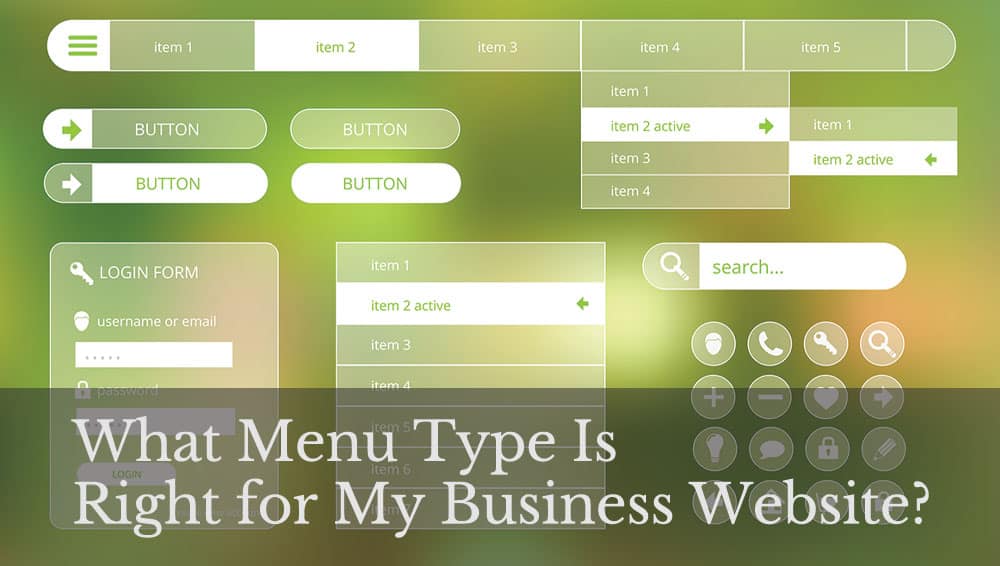
Many designers would argue that the navigation structure of your website is one of the essential elements for user experience (UX). The way you present the hierarchy of your site can vary widely. You can find many different menu types, including horizontal, vertical, hidden, hamburger and dropdown. The one that works best for your business will depend on your target audience and the rest of your design.
According to research, the average session duration is one of the top metrics tracked by website owners. The numbers vary widely, but a high bounce rate might indicate visitors can’t find what they want and click away from your site quickly. Improving your menu helps people find what they need and keeps them on your page longer.
The best way to figure out which menu type is right for your online presence is to study what others have done. You should also do some A/B testing and see what your users respond best to. Here are nine options for your consideration.
1. Standard Horizontal Menu
One common menu type is the horizontal design that has five to seven categories and sits at the top of a website. It works well for sites that are traditional or need to exude a level of trust, such as a financial institution. The only drawback with this type of menu is that it doesn’t always translate well on a mobile device, taking up several lines of space. You will want an alternative for smartphone browsers.
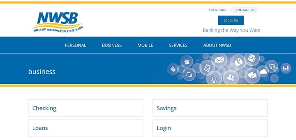
New Washington State Bank serves both consumers and businesses in the community. To instill a level of trust, they chose a classic layout. Note the horizontal menu pointing to the main areas of the website.
2. Fixed Header Menu
If your website is lengthy and the user must scroll down to get all the information, a fixed menu keeps navigation at their fingertips at all times. No matter where they are on the page, they can click to another area.
A fixed header menu can be a bit distracting, so make sure you’re using it only when needed to combat long pages of information. Most people won’t read all of your content in detail but will instead skim through it. A fixed header menu is more intuitive in those cases. Pay attention to the words used in your menu categories. Small businesses that pay attention to SEO create higher conversion rates for their sites.
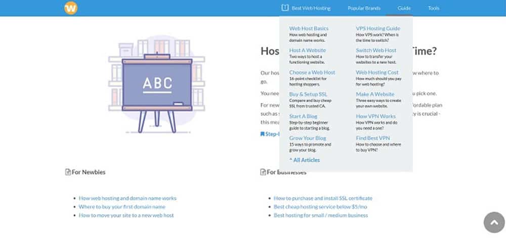
3. Mega Menu
Mega menus have a lot of advantages. If your site is large, breaking the topics into categories and subcategories makes it easier for consumers to find what they want. A mega menu expands and gives you more space to add details, such as images, icons and specific features. If you feel your standard menu is lacking something, the solution could be a mega menu. Keep in mind, however, that these menus don’t work well with smaller screen sizes.
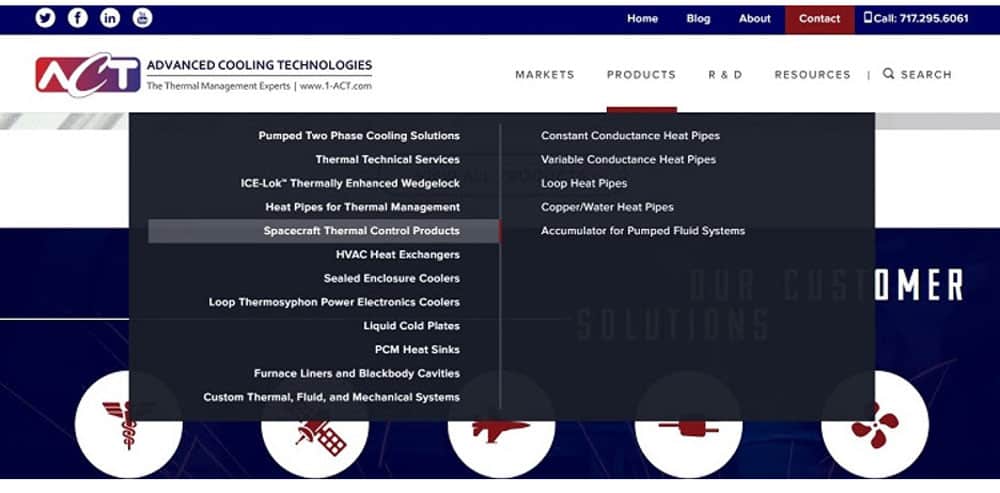
Advanced Cooling Technologies utilizes a two-column mega menu that breaks down each main category into a series of subcategories on the right. The structure of the navigation guides the user toward the exact page they need to be on. The buyer’s journey becomes simplified, and the potential lead finds the required information quickly and easily.
4. Icon Menu
You’ve heard the saying that a picture is worth 1,000 words. People respond to images in a way they don’t respond to text. If you’re tired of the same boring navigation menu, try adding some icons to point users where they want to go. Some of the standard images would be an envelope or @ symbol for “Contact Us,” or a little house outline for “Home.”
You can take things a step further and use beautiful custom photographs for different areas of your site. If you choose this method, it’s probably best to add word captions, too, to avoid any chance of confusion.
5. Hamburger Menu
People either love or hate hamburger menus. They’re recognizable because of how many websites use them for mobile pages. They take up very little space, ideal for if you want the focus on something other than your navigation. For example, a landing page should point the visitor to your goal, such as filling out a form. Navigation can distract, so hiding the menu in a hamburger is a valid option that still keeps the website categories accessible.
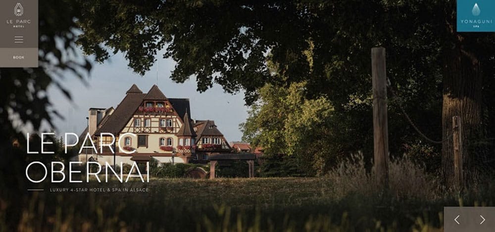
Le Parc Obernai is a luxury hotel and spa in Alsace, France. Note that they utilize most of the space on the page to highlight their beautiful establishment and grounds. The menu collapses into a hamburger menu on the upper left. If you want to navigate elsewhere, you click on the icon, and a full menu appears in the center of the page with all the main categories.
6. Dropdown Menu
Dropdown menus are another popular option for websites. They can either drop down when the user clicks on one of the buttons, or they drop down when the person’s mouse hovers over the area. Dropdown menus work well to highlight the major categories but show what specific subcategories are available. They take up very little space on the page and don’t mess with the aesthetics of your design.
Web Hosting Secret Revealed utilizes a dropdown menu to highlight the different sections of their site. The main navigation features only four choices. Their dropdown requires a click on the main area to reveal the expanded menu. Note the use of a single icon to highlight the category they want you to pay the most attention to. By limiting the number of links, they free up space for the added icon, and the eye goes to the top-left corner.
7. Bottom of Page Menu
Although you see this particular menu rarely, it works well for sites where the design fills the width of the screen without scrolling. You could also do a fixed bottom, so the menu stays visible as the user scrolls from top to bottom and back again. Since most readers start at the top left of the page, placing the menu at the bottom takes attention away from navigation elements.
Websites that might benefit from the bottom of page menu design would be a portfolio and creative endeavors. Most businesses should stick with a more traditional option. Think about who your typical buyer persona is. Will they relate well to a unique design they may not have seen before? You can also test a bottom of page menu and see how your target audience responds. It’s fairly easy to move it back to the top if it doesn’t work out.
8. Vertical Menu
Vertical menus aren’t quite as popular as horizontal menus. However, they aren’t so far out of the norm that people won’t know where to find links to other areas of your site. With vertical navigation, you create a permanently visible page menu. You can hide it within a hamburger and have it expand upon clicking for mobile devices or keep it fixed for desktops. A menu to the right or left grabs more attention than a horizontal menu, which users often ignore for a few seconds.
The average reader looks at your page in a zig-zag pattern. Therefore, they might look to the top left and then scan down the left side or shift over to the right sidebar. The only way to be sure what patterns your website visitors use is by studying heatmaps specific to your online presence and seeing what areas get the most attention and clicks.
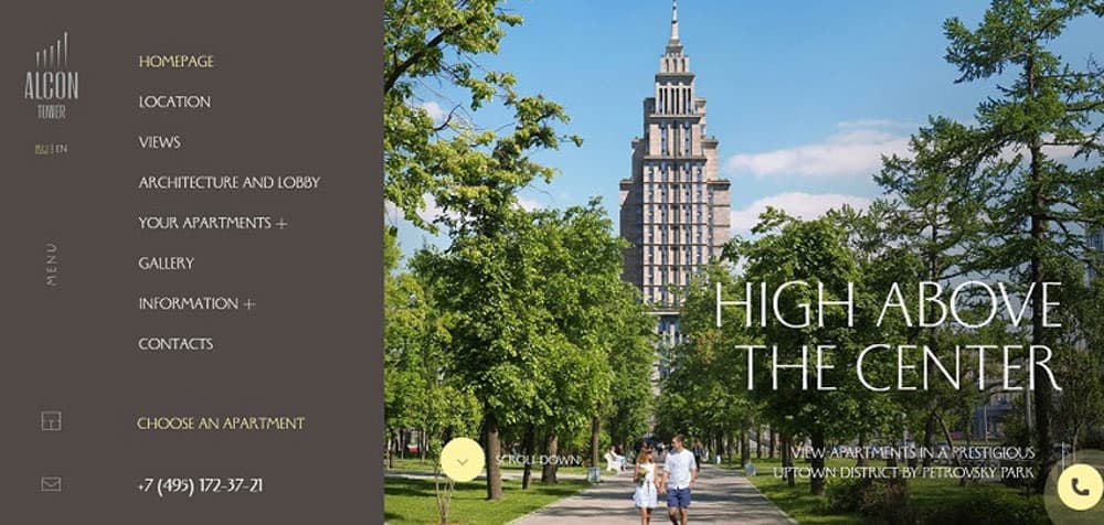
Alcon Tower in Moscow, Russia, uses a vertical navigation bar on their website. The sidebar works well with the looming image of the tower, balancing the features on the page and drawing attention to areas on the site people might want to visit. As the user scrolls down, the menu collapses, leaving only the word menu on the left along with an icon for contacting them and their logo. Click on the word “Menu,” and the full vertical menu reappears no matter where you are on the page.
9. Storyline Navigation
Some sites trend toward little to no navigation and instead rely on a storyline to guide users through. Again, this type of modern design is better suited for a portfolio of a photographer, graphic designer or some other kind of artist. Most businesses are not served well by hiding navigation.
A storyline points the user right where you want them to go. You either use parallax scrolling or add interactive elements where the browser walks through areas of your website in the order you want them to move. You’ll find few to no options. There might be a home or contact button outside of the main screen, and that’s about it in the way of navigation.
Perfecting Your Website Navigation
Finding the perfect menu type for your website isn’t easy. You must determine what your audience prefers and try different arrangements until you hit on the one that gets the most conversions. Study what your competitors do for their nav hierarchy, but don’t be afraid to step outside the box and try something different.
The most important thing is that your navigation is easy to use, and your site visitors find what they’re looking for without growing frustrated. Push them through the sales funnel toward the areas you want them to visit. With trial and error, however, you’re guaranteed to find success.

Lexie is a digital nomad and web designer. If she’s not traveling to various parts of the country, you can find her at the local flea markets or hiking with her goldendoodle. Check out her design blog, Design Roast, and connect with her on Twitter @lexieludesigner.
About Glenn Brooks
Glenn Brooks is the founder of WebWize, Inc. WebWize has provided web design, development, hosting, SEO and email services since 1994. Glenn graduated from SWTSU with a degree in Commercial Art and worked in the advertising, marketing, and printing industries for 18 years before starting WebWize.