When you’re in tune with life, and your surroundings feel serene, peaceful design is at play. Certain colors and items bring comfort and calm to almost any setting. How do you achieve a peaceful design?
Once you have a general idea of what you want your website to accomplish, it’s time to think through the emotions your site evokes in the user. There is an entire psychology to color choices. For example, red is known to elicit excitement, so a peaceful web design would avoid using colors too bold or vibrant and go instead with pastels, muted tones and cool tones.
Consider using monotone color palettes to keep things simple. Create image overlays to give all the photos the same look and use different depths of the same shade to create a calming tone.
The images you choose also impact your design’s peaceful feel. Make sure all elements work together, the user interface (UI) functions perfectly and the steps through the buyer’s journey are clear. Remove any potential frustration for the user, so the serene look isn’t spoiled. Here are six examples of gorgeous, peaceful designs to inspire you:
1. Use Pastels
Pastels are the softer shades on the color wheel. They add a calming effect because they aren’t harsh on the eyes. You can further intensify their impact by using gradients. Go for the lightest pastel shades, as some brighter hues can have a more vibrant feel that isn’t as calming. When looking at your brand’s color palette, choose the softest shade possible that meshes with your design.
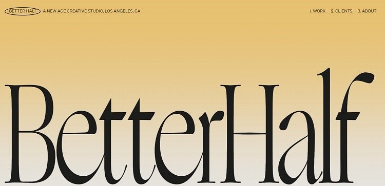
Better Half sticks with a soft yellow that fades near the bottom of the fold. They rely on their typography to make an impact, using huge letters to show their studio name. What you first see when you land on the page is the color yellow and the site’s brand name. There is nothing else to distract from the overall peaceful design.
2. Overlay With Dark Mode
In September 2019, Apple released dark mode on iOS, and the design took hold. The idea is that the darker tones are much less stressful on the human eyes. If you spend a lot of time reading digital screens, the darker tones are a break for tired eyes.
As a bonus, dark mode also has a placid effect, easing the nerves. The trend soon took hold both on iPhones and in website design. Darker hues appear on all types of websites now — and especially on mobile apps.
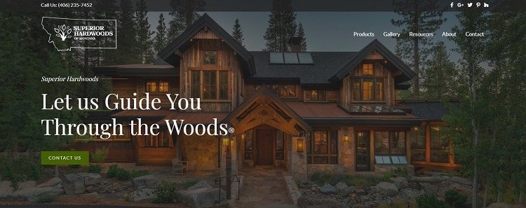
You may feel almost as though you are viewing the image through the last stages of a sunset just before night falls. You can practically hear the crickets chirping and feel a gentle breeze ruffle your hair. The entire result is peaceful and assures you that they’ll help you find something long-lasting for your home.
3. Include Unfocused Pictures
You might naturally steer toward using sharp images. However, a fuzzy photo evokes the imagination and adds a level of calm you don’t get from sharp edges. There is an artistic flair to an unfocused photo without the harsh focus.
The user can more easily imagine themselves in the setting. You leave things open to the imagination and encourage a bit of daydreaming. By using unfocused pictures, you allow potential customers to imagine themselves anywhere within the images. This technique taps into the emotions of whoever is viewing the photo.
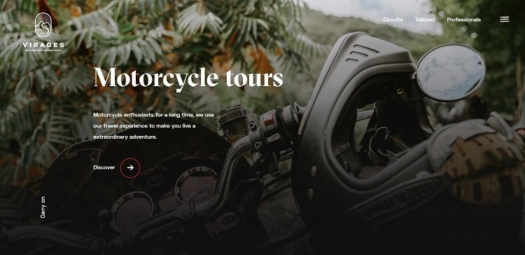
Virages offers motorcycle road trips, which you might think would call for an exciting design. Instead, they choose something soothing to show how you can relax while on one of their French tours. Note the fuzzy focus of the photo.
The site uses a motorcycle in front of a serene outdoor setting. You can’t quite make out the hills in the distance or even what type of plant is in front of you. You simply indulge in the view of the great outdoors and the quiet setting without interruptions.
4. Go With Minimalism
A minimalistic design can be quite soothing to the viewer. Cut down on the internet’s noise by focusing on one main goal for your page. Remove any clutter not belonging to or adding to the goal in some way. The buyer’s journey should be clear. Where does the user go next? Limit choices to avoid confusion and aggravation.
Less stuff gives site visitors the chance to move through your website without worry. They don’t have to make choices, which can be highly stressful for some people. Everything is laid out clearly and has a specific place.
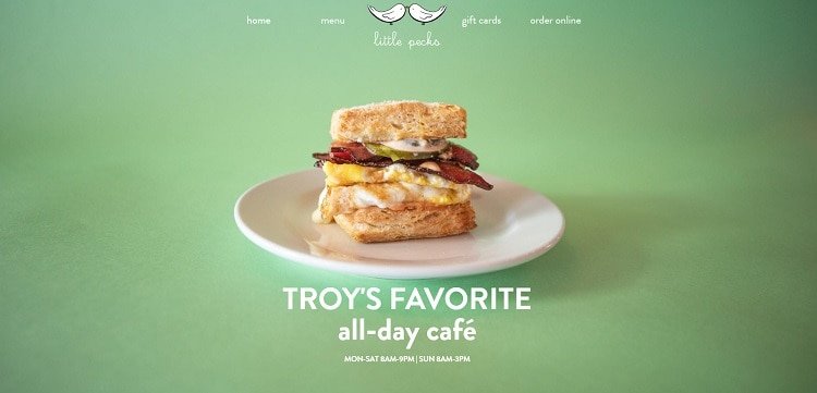
Little Pecks keeps their entire design simple. Note the adequate white space, so the page never feels cluttered or busy. The background is a soft green, which adds soothing tones. Even the white text isn’t a bright white. There is nothing harsh on the page to disrupt the peaceful feel. Customers know they are going to have a relaxing time when they visit this cafe.
5. Utilize Soft Music
Although some designers have gotten away from music because it can drag down page load speeds, many are turning to it again. In a time when internet speeds are blazing fast, and even rural areas are gaining access to faster connectivity, adding in some gentle tunes may be enough to take your design from so-so to one of the most peaceful layouts available.
Be careful of the music you choose, though. You don’t want grating elevator or call holding music. You want something that closely matches your brand’s tone, so users can enjoy it. At the same time, it shouldn’t be distracting, and users should have an option to turn it off if they are in an office or public setting without access to earphones.
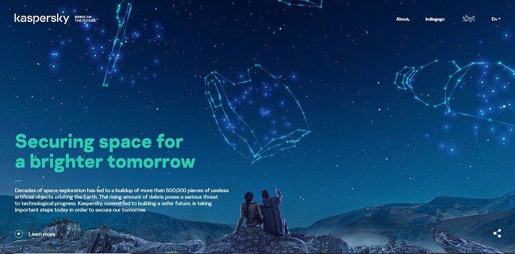
Kaspersky uses images of deep space to fill the screen and give a sense of serenity. When the page loads, a soft mystical tune plays. The lilting tones soothe the ear and give the listener a picture of the vast nothingness beyond the Earth’s borders. It’s inspiring and relaxing at the same time. Occasionally, you hear the soft hoot of a night owl, as though you’re lying in your backyard staring up at the sky’s beautiful constellations.
The background is filled with blues but does have an animated feature where it looks like the stars twinkle a bit. The colors used on the page are also soothing. Note the tagline in a soft green. While still contrasting with the background, it is also a complementary color to blue, so it isn’t a harsh contrast. The shade offers just enough difference to make the letters readable.
6. Focus on Imagery
The photos you choose for your website make a huge impact. People often say a picture is worth 1,000 words. The human brain processes images much more effectively than words alone. People also tend to remember the content of a visual for longer. Increase the peace factor on your site by choosing images that evoke the right emotions.
Of course, the images you choose depend upon your business model. For a spa or hotel setting, you’d look for cozy hideaways and spots with beautiful views and peace and quiet. A crowded pool doesn’t send the right message. An empty pool with one person swimming does.
If you aren’t sure how to decide between the visuals you have available, conduct some split tests to see which one evokes the feelings you’re going for. Talk to your site visitors about which image seems more peaceful to them.
Once you choose the photos, you can pull colors from the picture to create a color palette for the rest of the site.
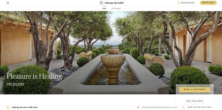
Auberge du Soleil is a luxury wellness spa in Napa Valley, California. The appeal of staying at their resort emphasizes relaxing and detoxing your body from stress and environmental pollution.
Note the image when you land on their site. It shows a serene scene of a fountain with some greenery and the landscape in the distance. There are also chairs where people can sit and relax. Everything about the picture whispers peace. The user is left with the thought that if you can’t experience calm there, you probably can’t find it anywhere.
Why Do You Need a Peaceful Web Design?
If you want to create trust between you and the user, then a peaceful web design takes away the anxiety of doing business with a new brand. Your business model may also need to focus on soft and calm moods. Obviously, if you’re running an entertainment venue or party planning business, you will want something a bit more exciting with bold design choices. However, many other types of companies benefit from peaceful site design.
Think about your core audience. What are their expectations of your brand? Do they expect you to be a calm, steady presence? If so, a peaceful web design is the right choice for you. If you aren’t sure, try it out and run some A/B tests to see which tone your target audience responds best to. With a little effort and attention to detail, your site will perfectly meet your customers’ needs and help you achieve your online goals as a brand.

Lexie is a digital nomad and web designer. If she's not traveling to various parts of the country, you can find her at the local flea markets or hiking with her goldendoodle. Check out her design blog, Design Roast, and connect with her on Twitter @lexieludesigner.
About Glenn Brooks
Glenn Brooks is the founder of WebWize, Inc. WebWize has provided web design, development, hosting, SEO and email services since 1994. Glenn graduated from SWTSU with a degree in Commercial Art and worked in the advertising, marketing, and printing industries for 18 years before starting WebWize.

