
What is an infographic?
A picture tells a thousand words. Infographic, as the name suggests, is the graphical representation of data, also called “Information design” or “Data Visualization.” What an excellent infographic does is that it takes complex data or even concepts and condenses it to simple easy to understand form using a combination of simple text and images. Infographics can represent information such as a simple pie chart, elaborate business growth statistics, interesting theories, historical perspectives or a trending news story. It is a neat visual aid that allows readers to digest information quickly and remember it more clearly.

History of Infographics
Infographics are nothing new. There are many examples of infographics throughout the history. Archaeological sites 25000 years old contain ancient infographics. Our cavemen ancestors used these images to convey stories to one another such as a battle.
The Chauvet cave paintings in southern France are the oldest instance of infographics; these paintings depict rare prehistoric species that scientists use as valuable research data.
The language of Egyptians is a mix of symbols and pictures, which can be called primitive Infographic. Oti Aicher, a graphic designer, and typographer, designed pictograms for the 1972 Munich Olympics, which are still in used on public signs to this day.
USA Today strives to make information more easily digestible by using infographics. USA Today Snapshots® infographics are used to express data in an easy to read format. Today infographics are used by news services and corporate to communicate their contest in simplified forms.
The advent of the social media helped infographics go viral, by sharing or tweeting a message and can be seen and understood by millions.
When should I use an infographic?
The great things about infographics are they are extremely flexible in their applications. Here are some occasions you may want to use one:
- To give your resume a little flavor, you can create an infographic resume and post it online.
- If you have survey data that you’d like to show to a broad range of people, you can use bar charts in an infographic
- If you are trying to make complex data easier to understand.
- If you are trying to compare data in a more attractive way.
- If you want to make interesting facts even more appealing, you can use an infographic with vibrant color fonts.
- For creating awareness to a cause in a creative and engaging manner through imagery.
How can an infographic benefit me?
Infographics are great visual tools to convey your idea in a concise and easy to understand form. They can help promote your brand and make your idea widely appealing. Here are some reasons why infographics are such a useful tool:
- Eye candy – Infographics are a play on image, color, text, and movement to create visually compelling content. By changing something as simple as the color, you can make a particular piece of information stand out more.
- Scannability – The average person has a very short attention span, and they tend just to want to briefly scan through content. Infographics are an excellent way to pack in lots of information in a relatively small space; it can be read and retained in a concise time.
- Shareability – Infographic embedded with code makes it as easy as a click to share across social media. They are visually appealing and concise that makes visitors more willing to share on social media. As a creator of the infographic includes your website address which can draw people to your page.
- Branding – Infographics offer a great way for brands to impress on its audience. When designed with high aesthetics about the colors, shapes fonts and logos, it has the potential to create much brand awareness.
- SEO optimization – An infographic can be used to rank higher in search rankings by adequate utilization and positioning of keywords. When shared, they can be used to create an inbound link to your website.
- Value – Great infographics add value to your content and generate comments from the audience this helps build better relationships.
What makes a good infographic?
Having good infographics on your website can attract tons of traffic, so it is important to spend much time when creating one. Here are some tips to assist you in making an excellent infographic:
Relevance – Is the subject you are doing trending on social media? Make sure to do your due diligence and research the topic of your infographic. It should be the relevant and informative image that narrates a memorable story using minimal text.
Readability – Your reader needs to get the gist of what you wish to see by just scanning the infographic. The more involved an infographic and the harder it becomes to scan, the more people are going to stop reading it midway. So it is always better to paint a good picture of your data and provide appropriate conclusions. Use colors to enhance the readability and guide users through your message. Don’t try to twist and turn the data to suit your ends.
Clarity – Sometimes less is more just keep it simple. Choose a small color palette and a few simple shapes and graphics. The important aspect of infographics is they should be concise and informative. Readers should have no issue trying to figure out the intention of the infographic.
Layout – There can be many ways of visually representing your message. Infographics encourage creativity so don’t be afraid to try different designs until you find one you like. If the content is more focused on giving numbers or percentages, one or multiple pie charts may be needed to present these facts. On the other hand, if the content is visual driven you can let images dominate and make them much larger than the text to get your message across. Always include your logo or website address to brand your infographic.
Factual – If you claim the information you are presenting to be factual and accurate make sure to cite any sources used. Be sure your infographic contains relevant data from reputable sources. Always recheck the facts and never forget to give credit to the sources of the data. Points help to build a level of trust between you and your follower, and this will always encourage them to follow more of your works.
Which type of infographic is right for me?
There are many types of infographics, but there are eight categories that can describe every type that you might encounter. Here is a list that you can use to guide you in choosing an infographic:
- The Visual Article – Social media readers prefer this type of material. It always has a large, strong title to create that initial engagement and contained in the infographic is much content.
- Number Porn – This infographic focuses on lots and lots of numbers, data, and statistics to portray its message. Images are used to guide users through the bountiful numbers.
- Photo Infographic – A photo infographic is an image dominate way to represent information. The image is used to convey the message easily.
- Versus Infographic – This type of infographic will place two things side by side for comparison purposes. It works well when you want to list the facts of two things you are trying to compare
- Useful Bait – The useful bait infographic is great to use if you want to communicate visually how to do something. It can be utilized to show how to do a dance routine in a fun and engaging manner, making it great to share on social media sites such as Pinterest.
- The Flow Chart – Flow charts are very appealing for readers. They answer questions and make choices while following along the infographic leading to a conclusion. They are an excellent humorous device.
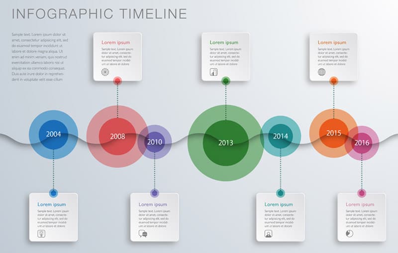
- The Timeline – Timeline infographics follow chronological dates to give users information on significant milestones or events that happened in between dates. They help users to feel like they are on a journey while teaching them facts.
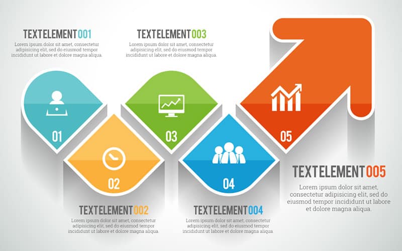
- Data Visualization – Data visualization infographics are where you can get the most bang for your buck when used correctly. They allow the user to represent complex or simple data using adequate visualization. It makes the reader grasp data much easier.
How can I make my infographic?
Infographics can be created using software like Adobe Illustrator or editing tools like PicMonkey. The simplest way to create your infographic can be to use online tools such as these:
Visual.ly offers a vast library of templates you can use to create your infographic. While you are at it, you can browse their website for inspiration in creating your infographic.
Piktochart prides itself on allowing you to create great infographics with just three steps. Start by picking a theme, then you can edit the selected topic, and finally, you will be able to share it online. It is free to try and a great website to start blooming your creativity.
Infogram offers many tools like charts, graphs, and maps. It also allows you upload images and videos to personalize and create compelling infographics. The editing happens in a spreadsheet. When you are happy with the results, you can share it on your website and other social media.
Creating infographics can be easy while being very effective. They combine the fun of images with a depth of data to create condensed information that is easy to share and understand. Start using them today and begin to impress readers.
Or Contact WebWize At 713-416-7111
Before making a final decision on a Web Design Company, spend a few minutes on the phone with us.
About Glenn Brooks
Glenn Brooks is the founder of WebWize, Inc. WebWize has provided web design, development, hosting, SEO and email services since 1994. Glenn graduated from SWTSU with a degree in Commercial Art and worked in the advertising, marketing, and printing industries for 18 years before starting WebWize.